Project info:
Role:
Sole UXUI Designer
Project:
Jonard Tools mobile re-design
Client:
Jonard Tools
Sector:
B2B
Project date:
June 2023-present
Sole UXUI Designer
Project:
Jonard Tools mobile re-design
Client:
Jonard Tools
Sector:
B2B
Project date:
June 2023-present
Company Overview:
Company introduction:
Jonard Tools is a renowned provider of high-quality hand tools and equipment for professionals across various industries. Jonard Tools offers diverse solutions designed to enhance efficiency and reliability. Their extensive product line includes specialized tools for telecommunications, electronics, fiber optics, and more. With a trusted reputation spanning over six decades, Jonard Tools remains a go-to choice for professionals seeking reliable tools to accomplish their tasks with utmost precision. Clients include Home Depot, AT&T, Comcast, and Verizon.
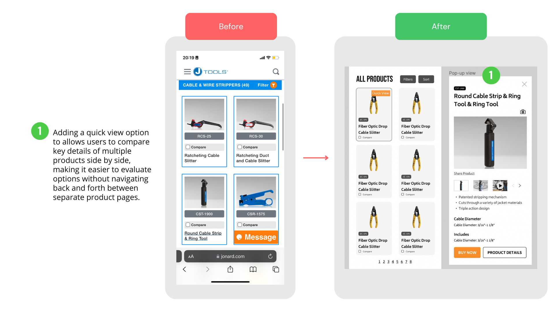
Since Jonard Tools is a B2B company, and in B2B mobile UX design, the goals typically revolve around meeting the specific needs of businesses and professionals and promoting efficiency, productivity, and seamless collaboration. Moreover, the audiences who come to B2B sites typically prioritize efficiency and productivity. The UX design should aim to provide quick access to relevant tool information, simplify/increase efficiency in tool navigation, a quick comparison with different tools, and provide tool assistance and guidance videos.
Problem overview:
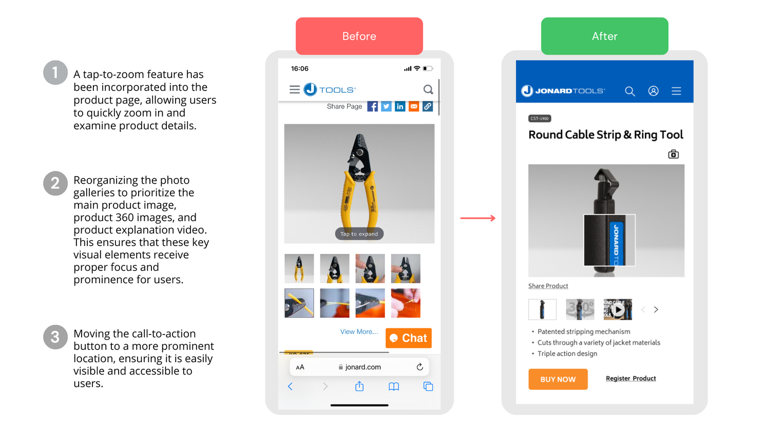
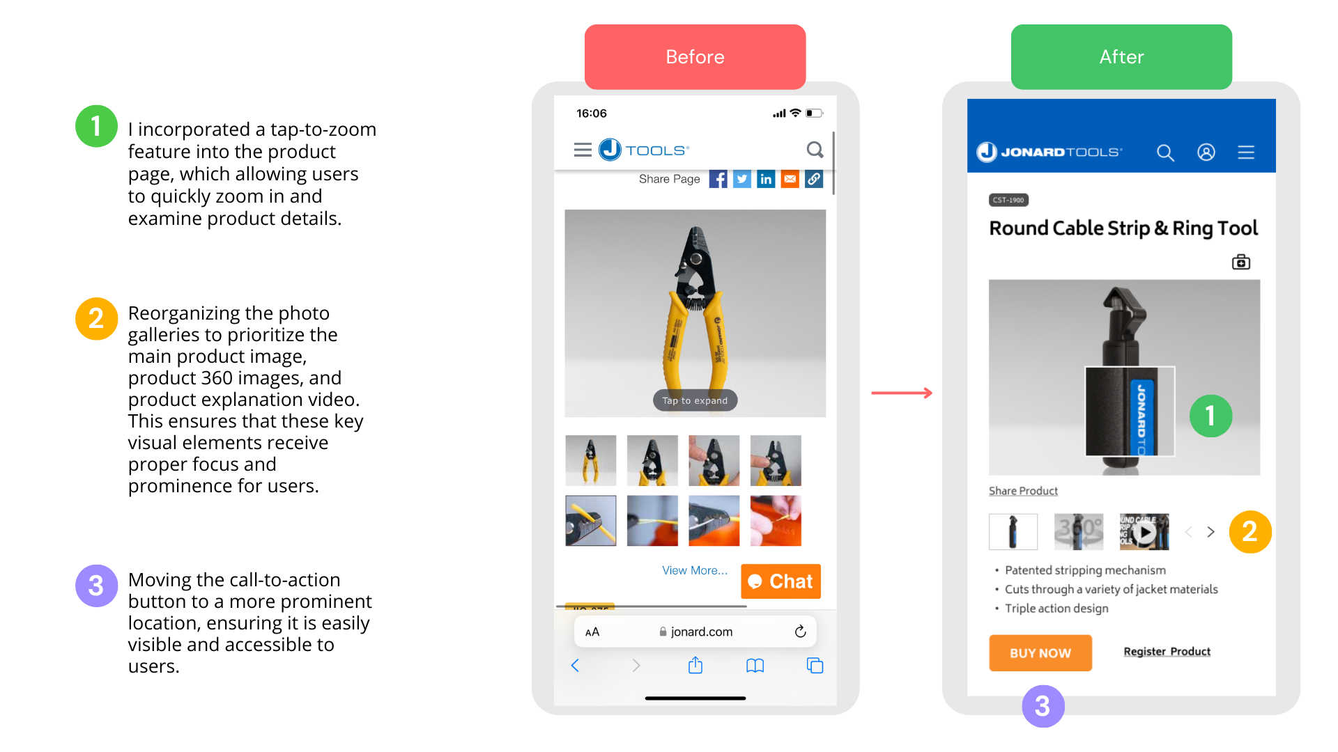
The current B2B mobile site needs several critical design and usability issues, hampering its effectiveness in serving business customers. I did an audit/heuristic evaluation of the current mobile site, as well as a competitor analysis for our direct/indirect competitors, such as Stanley Tools, Craftsman, Ridgid, Dewalt, Klien, Ryobi, Makita, Kobalt Tools, Milwaukee, Bosch, and some other very successful companies that have innovative design fro product pages such as Yeti and Apple. Here is an overview of some problems that need to be addressed in the redesign process:
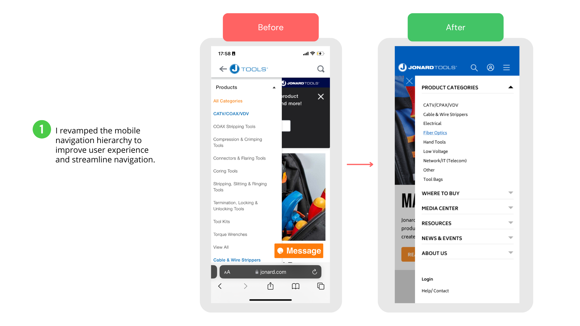
- Complex Navigation: the site’s navigation structure is confusing, making it challenging for users to find relevant information or navigate between different sections. The product name is below the pictures of the product, making it less intuitive for users to find product information. Moreover, the find local retailer purchase option disappeared on the mobile site, so the user only has one option: purchasing through online stores such as Lowe’s and B&H.
- Poor information hierarchy and inconsistency in design: The information hierarchy on the website is inadequate, and there are design inconsistencies that need attention. For instance, the product code displayed on the industry page does not match the product code on the product page. This inconsistency can confuse users and raise doubts about whether they are viewing the same product information across both pages. Additionally, the home page suffers from clutter, with less important information, such as tools and YouTube videos, taking up space and hindering the website's effectiveness in achieving business goals.
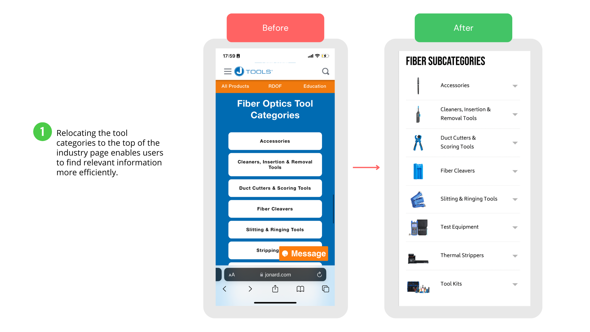
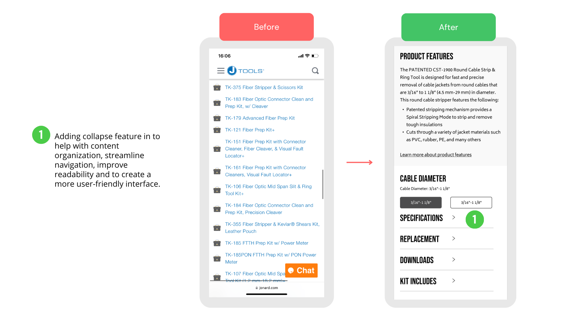
- Difficult navigation, overwhelming content, and limited mobile responsiveness: There were over 198 products on one industry page, which makes users feel overwhelmed, which might lead to frustration and abandonment. All the product’s specifications, replacements, downloads, used in information are on the same page with no collapse/ expand text feature. When mobile devices have limited screen space, it’s essential to consider the limited screen space available. Too much content on a single page can result in excessive scrolling, zooming, and a disjointed mobile experience.
Addressing these challenges in the B2B mobile site redesign is crucial to improving user experience, increasing engagement, and driving conversions. By focusing on responsiveness, comprehensive product information, and improving navigation, the redesigned mobile site can better serve the needs of B2B customers and provide a competitive advantage in the market.
Design that can help with Comprehensive Product Information:


Improving Navigation:
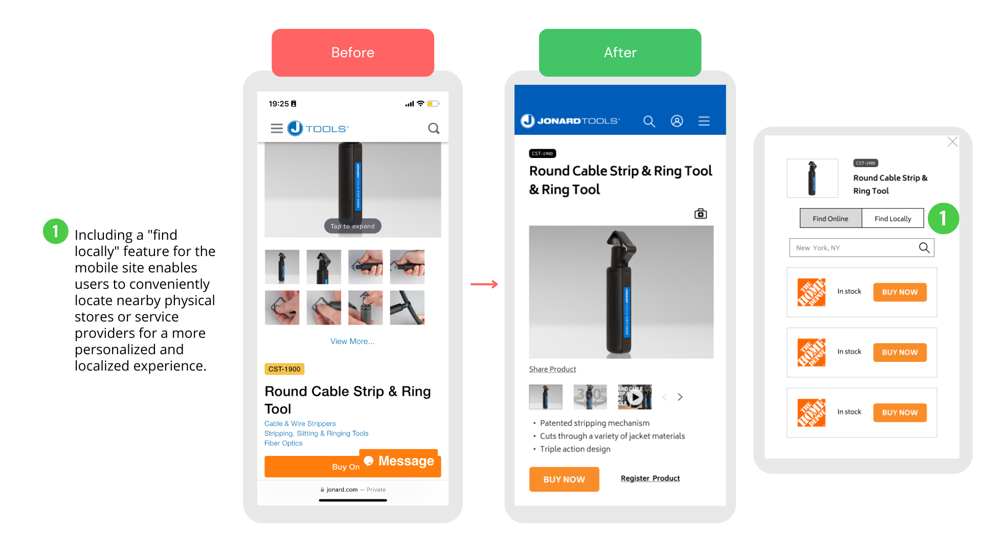
Enhancing the efficiency of product information:
Result
After incorporating feedback from multiple stakeholder rounds and making necessary revisions, the client is thrilled with the design.
The final version has been passed on to the developers, who are currently in the process of implementing it.
The final version has been passed on to the developers, who are currently in the process of implementing it.

